Eye Candy: Sweet Style, Pop Design and the Joy of Colour

With Halloween approaching, I find myself thinking back to my first trick-or-treating days in early 70s Osceola, Indiana. Wet leaves underfoot, my princess costume shielding me from the rain, paper bag slowly filling. The sweet treats were good, but the packaging made an everlasting impression. All stripes, bold graphics and cartoony fun.
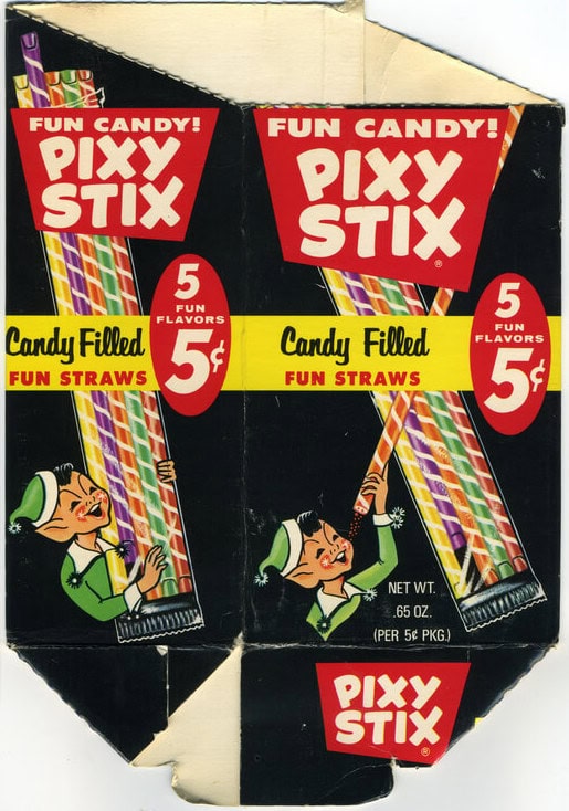
Pixy Stix came in striped paper straws that snapped to unleash tangy coloured powder straight into your gob — pure, reckless joy in a cascade of colour.
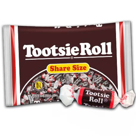
Tootsie Rolls were the opposite: neat brown cylinders with crisp white ends and strips of red framing the rounded Cooper Black type. Bold yet understated.
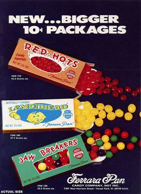
Then there were the Ferrara Pan greats – Lemonheads, Red Hots, Jaw Breakers… The labels alone were irresistible. The Lemonheads were named after the candy (Evan Dando’s new album is worth a listen). And who doesn’t want to brave something called an Atomic Fire Ball?
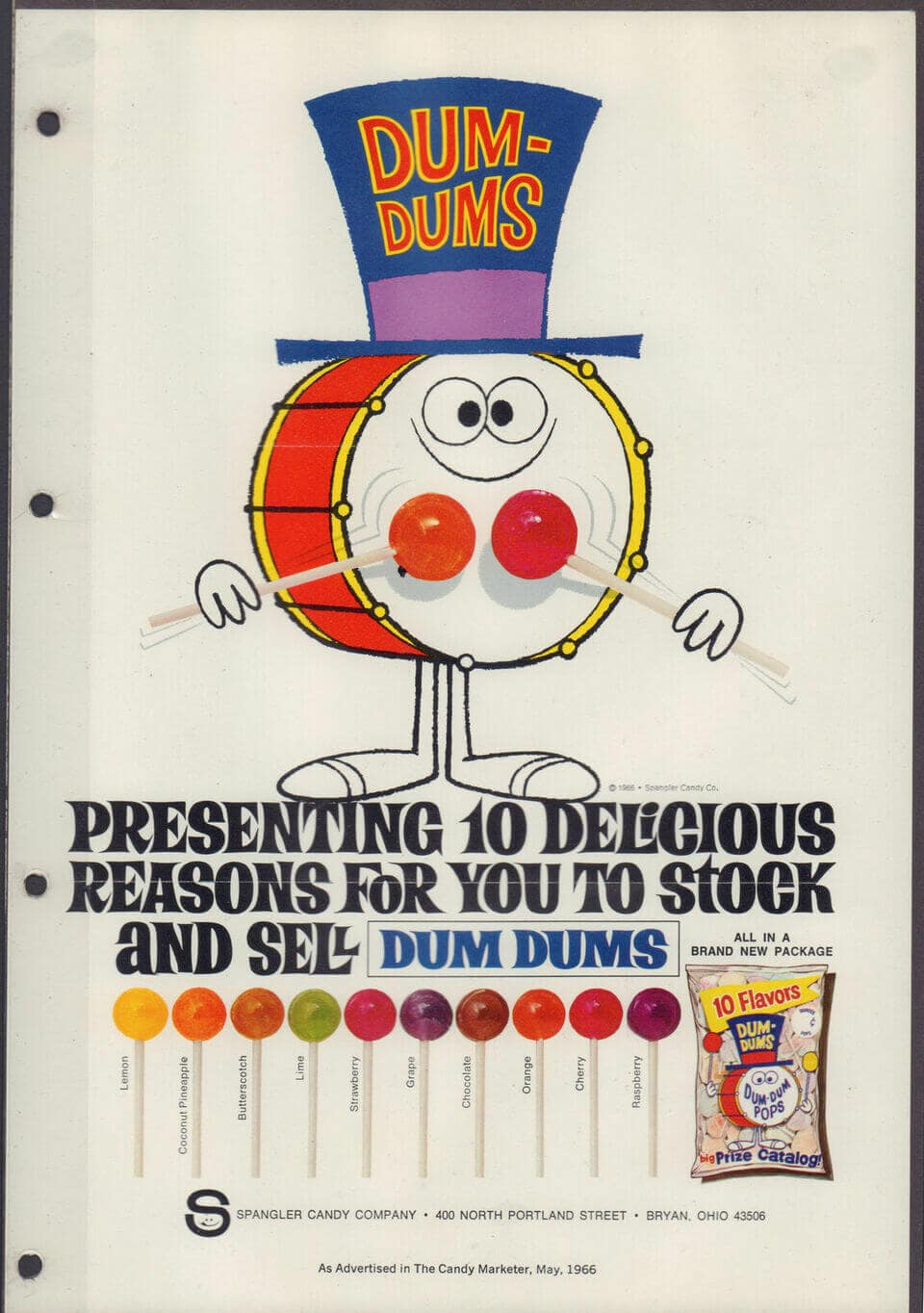
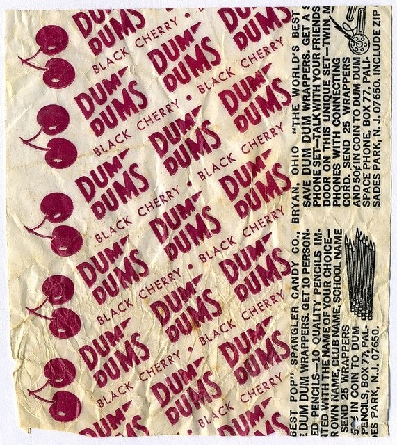
Dum-Dums had that wonderful pattern repetition of the logo printed over and over around the lollipop wrappers — which held great value! The tactile stack of waxy papers felt like a wad of cash in a kid’s hands. Save them, send in with a coin or two, and a novelty item would arrive in the post.
Bottle Caps were a genius combo – soda pop turned candy. The bright green pouches fizzed with charm, the caps brought to life with googly eyes and classic cartoon hands.

Maybe that early sweet-wrapped education stuck. For Ops&Ops’ first trade show in New York, our shoes were lined up like colourful confections. At an early pop-up on Calvert Avenue in Shoreditch, visitors could spin our Wheel of Fortune to win prizes — candy, records, toys, moola off a pair of shoes — or guess how many shoehorns filled a candy jar. It was a mix of chance, colour and play that is still very us.


So go on — take your pick’n’mix.
")
